A good design board doesn’t just showcase a design—it tells its story. Discover the key tools and strategies to communicate your projects clearly and effectively.
Architectural presentation boards are much more than a collection of images: they are the bridge between your design vision and the client’s understanding. A well-thought-out composition, with a clear visual hierarchy, can determine whether your proposal is remembered or forgotten.
01 · Why the board matters as much as the design
In architecture, the quality of the design and the quality of its presentation go hand in hand. You can have the most ingenious project in the world, but if the drawing board doesn’t guide the viewer’s eye in a logical and engaging way, the message is lost.
An effective concept board combines technical drawings, diagrams, images, and, in some cases, animations. Together, these elements distill complex concepts into simple visual representations, allowing any viewer—whether architect, client, or investor—to grasp the essence of the project at a glance.
“A presentation board is the visual narrative of your project: it shows not only what it is, but why it exists and where it is going.”
02 · Essential tools: spell check and clean background
Every architectural project needs its fundamental 2D representations: plans, sections, and elevations. Producing these accurately is straightforward thanks to the orthographic view, which allows you to cut the model at any point to generate detailed sections, with the option to fill the cut areas with custom color or material.
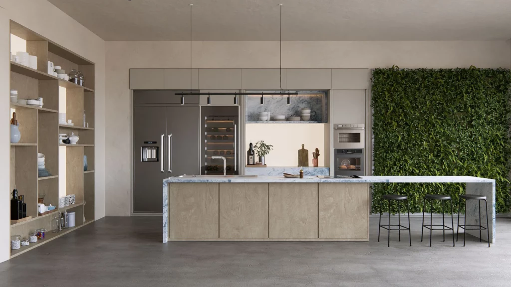
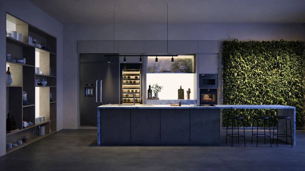
Within the same mode, you can switch between 2D and 3D. In 3D, you can create one-point perspectives or section perspectives—a combination that showcases the clarity of a cross-section with the depth and realism of a perspective, dynamically revealing a building’s interior spatial relationships. These are especially powerful for presentations to non-technical clients, as they unify section reading with intuitive spatial understanding.
For diagrams—masses, exploded axonometric views, circulation, zoning—removing the surrounding context makes the design the absolute protagonist. Replacing the sky and landscape with a solid color ensures that what you want to highlight takes center stage without distractions.
03 · Personalization: each board tells a unique story
Each presentation board reflects a unique set of ideas, and that uniqueness should permeate every visual decision. You can combine effects that emphasize volume over materiality—useful when you want the focus to be on the mass rather than the finishes—or use cutaways with specific colors so that the sections are fully legible without requiring extra work in post-production.
In diagrams with a removed background, the choice of background color is entirely up to you, and you can also influence the tone of the lighting and shadows. This opens the door to playing with contrast and the graphic identity of each board, aligning it with the spirit of the project.
04 · Layout and visual flow: the key that is often ignored
Creating a design board is more than just displaying designs: it’s about presenting them clearly and engagingly. A well-thought-out layout, with a solid visual hierarchy and consistent style, can make all the difference. Four fundamental principles:
Logical reading order. Organize the elements from left to right and from top to bottom, following the natural path of the eye: brief, site plan, concept, development, floor plans, sections, elevations, 3D visuals, and construction details.
Intentional white space. A clean, balanced layout allows your design to breathe. Avoid clutter; technical drawings should be clearly and accurately scaled.
Grids as a structure. Whether digital or printed, use a grid to organize the hierarchy of elements. This ensures consistency of scale and alignment across all boards.
Unified graphic style. Maintain consistent typography, color palette, and graphic language across all boards. This not only brings clarity but also makes your presentation visually distinctive and reflective of your design aesthetic.
The right visual flow follows the same path as a good story: it begins with the context and concept, delves into the proposal, and ends with the technical details and the final image. The viewer shouldn’t have to search for the information—they should find it naturally along the path you’ve laid out.
05 · The recommended order for a complete board
If you’re structuring a board from scratch, this flow usually works very well:
- Project type, brief and survey of constraints
- Site plan and context analysis
- Concept and main idea, with sketches and mass diagrams
- Zoning and use of spaces
- Upper and lower floors
- Sections (longitudinal and transverse)
- Elevations and elevations
- 3D visualizations (exterior and interior)
- Construction and technical details
An architectural presentation board isn’t the end of the design process—it’s its culmination. With the right tools, thoughtful composition, and a consistent visual language, your projects will communicate not just what they are, but why they’re worthwhile.